
AFF Rebrand - Empowering Teams Through Modular Design
1. Overview
During American First Finance’s rebrand, I created scalable WordPress modules that empowered teams to update the website faster and more independently. This case study shows how I balanced design, systems, and collaboration to deliver a flexible, future-proof digital experience.
Streamline Digital Workflows
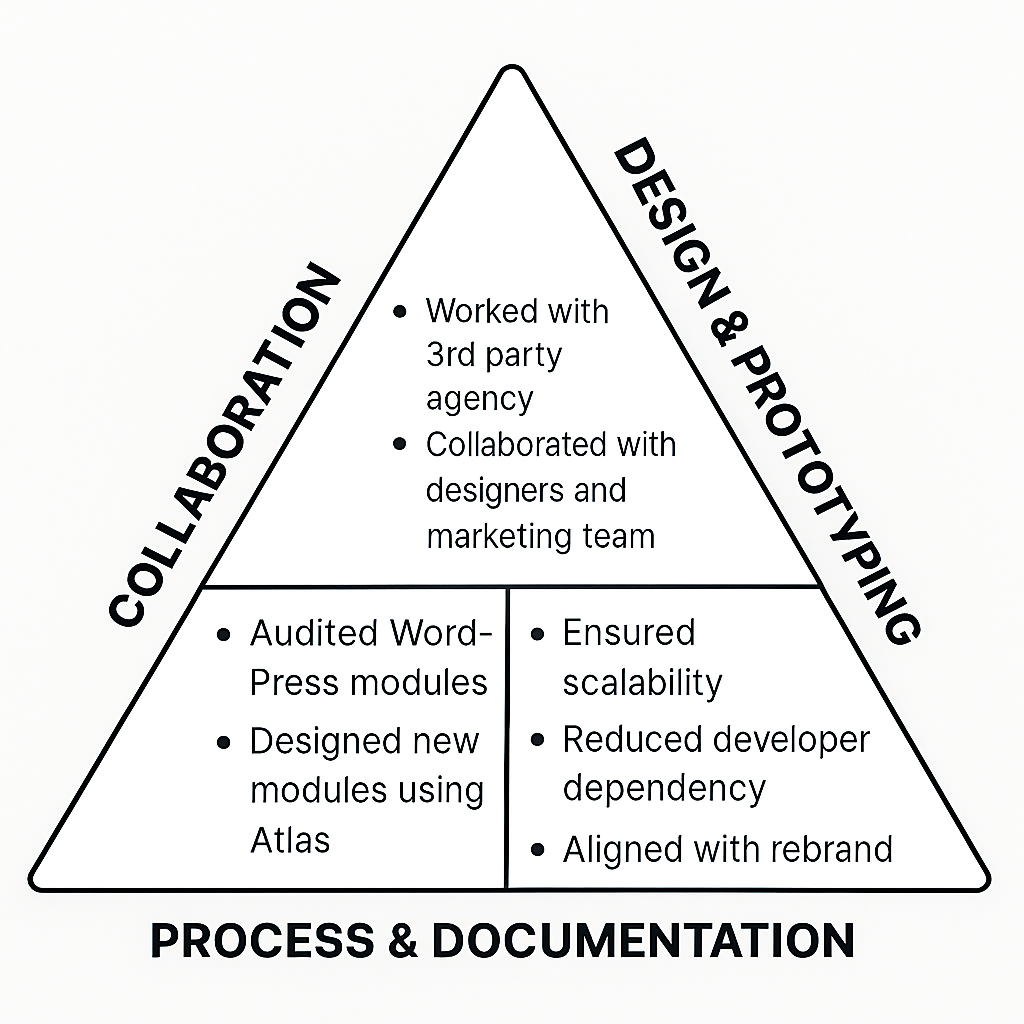
As a Product Designer at American First Finance, I redesigned and documented flexible WordPress modules that brought the new brand to life, reduced dependency on developers, and empowered teams to manage content efficiently, collaborating closely with designers, marketing, and a third-party agency along the way.
Breaking Old Bottlenecks
Challenge
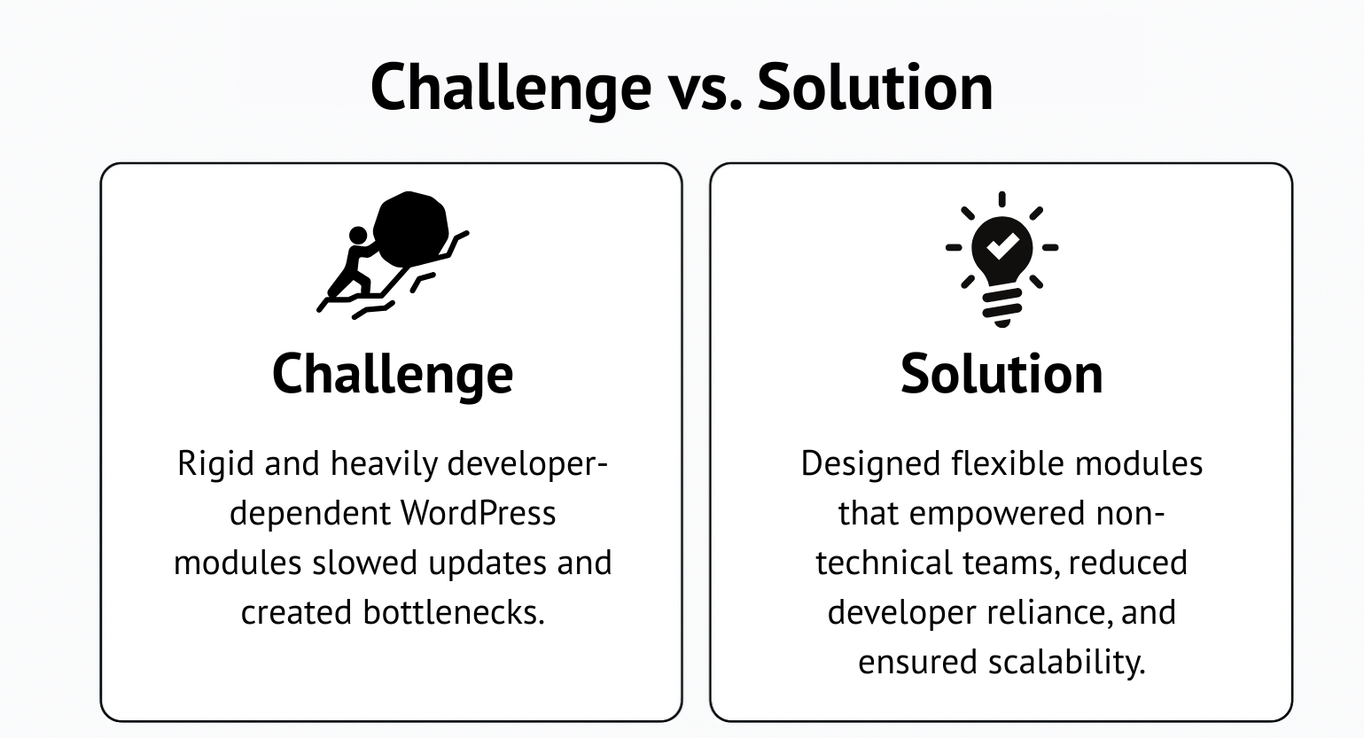
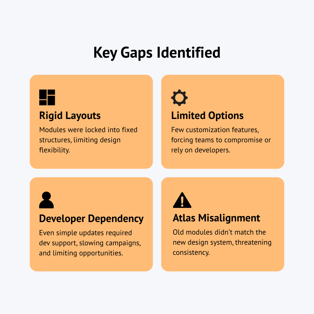
The existing WordPress modules at American First Finance were rigid and heavily developer-dependent, making even small updates slow and inefficient. This created bottlenecks for the marketing and design teams, especially as the new Atlas design system and rebrand demanded more flexibility and scalability than the old setup could support.
Solution
To overcome these limitations, I audited the existing modules, the new website design, and the Atlas design system to identify gaps. From there, I designed and documented new, flexible modules that empowered non-technical teams to update content independently, reduced reliance on developers, and ensured the site could scale with the rebranded identity.
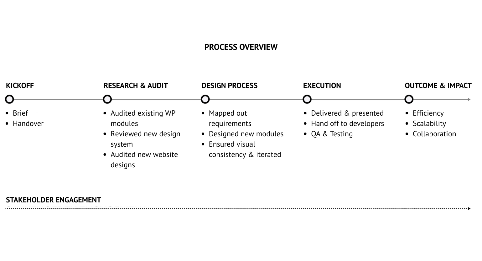
4. Process
Challenges Forge Change
Every obstacle revealed an opportunity for innovation. Through careful auditing, alignment, and iteration, challenges evolved into the foundation of a more flexible, scalable module system.
The Clarity of Insight
Audited existing WordPress modules
I audited the existing WordPress modules and pinpointing clear gaps that shaped the requirements for scalable, flexible replacements. By mapping these shortcomings against the requirements of the Atlas design system and the upcoming rebrand, I was able to pinpoint where the old modules fell short and define opportunities for new, more scalable solutions.
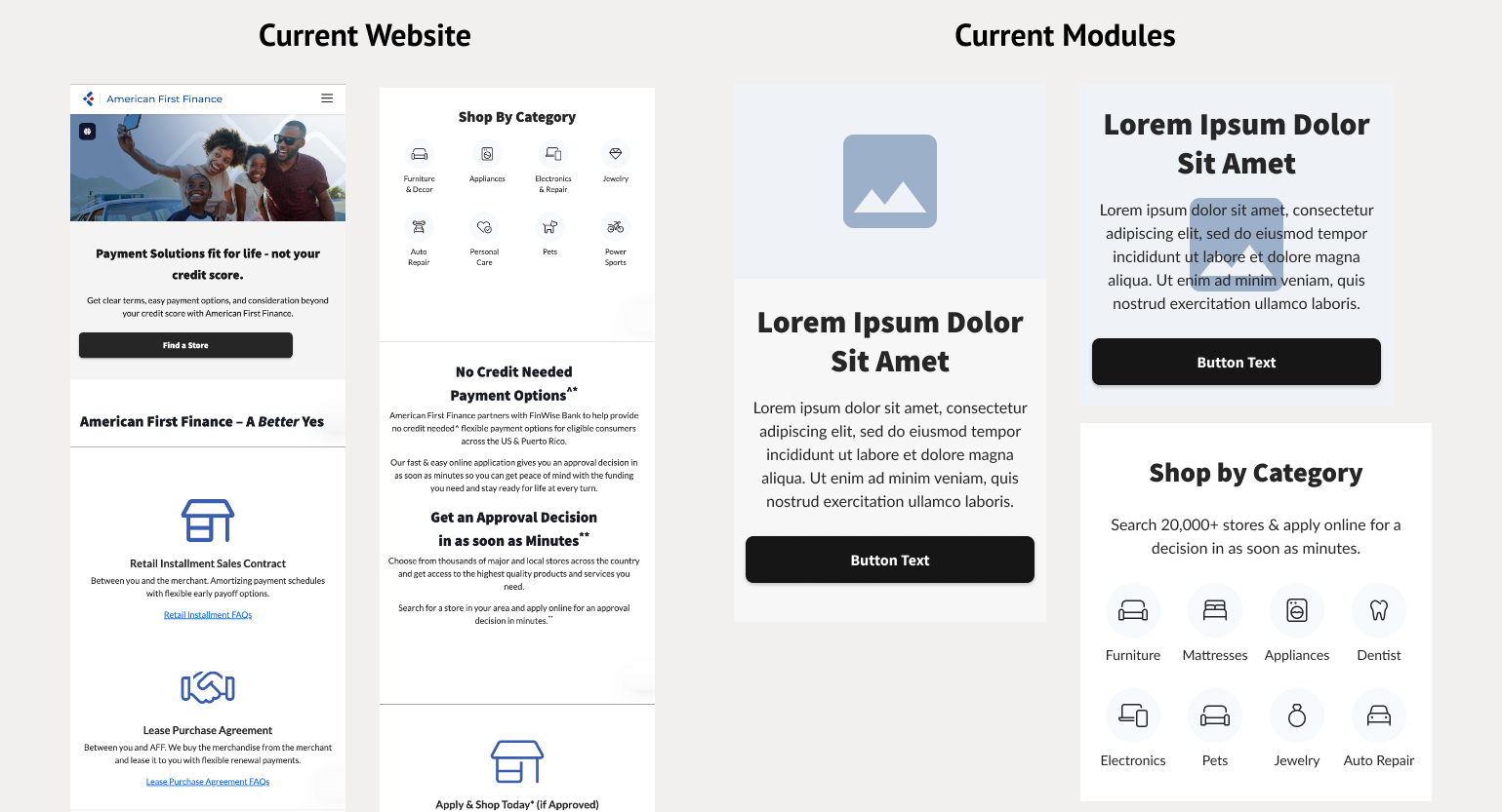
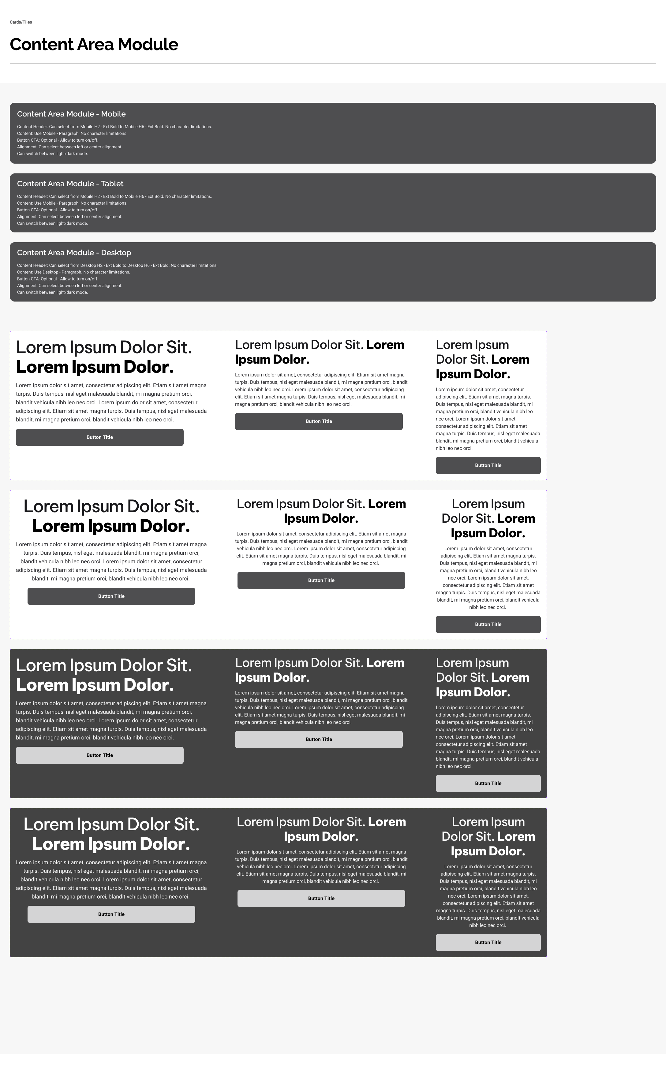
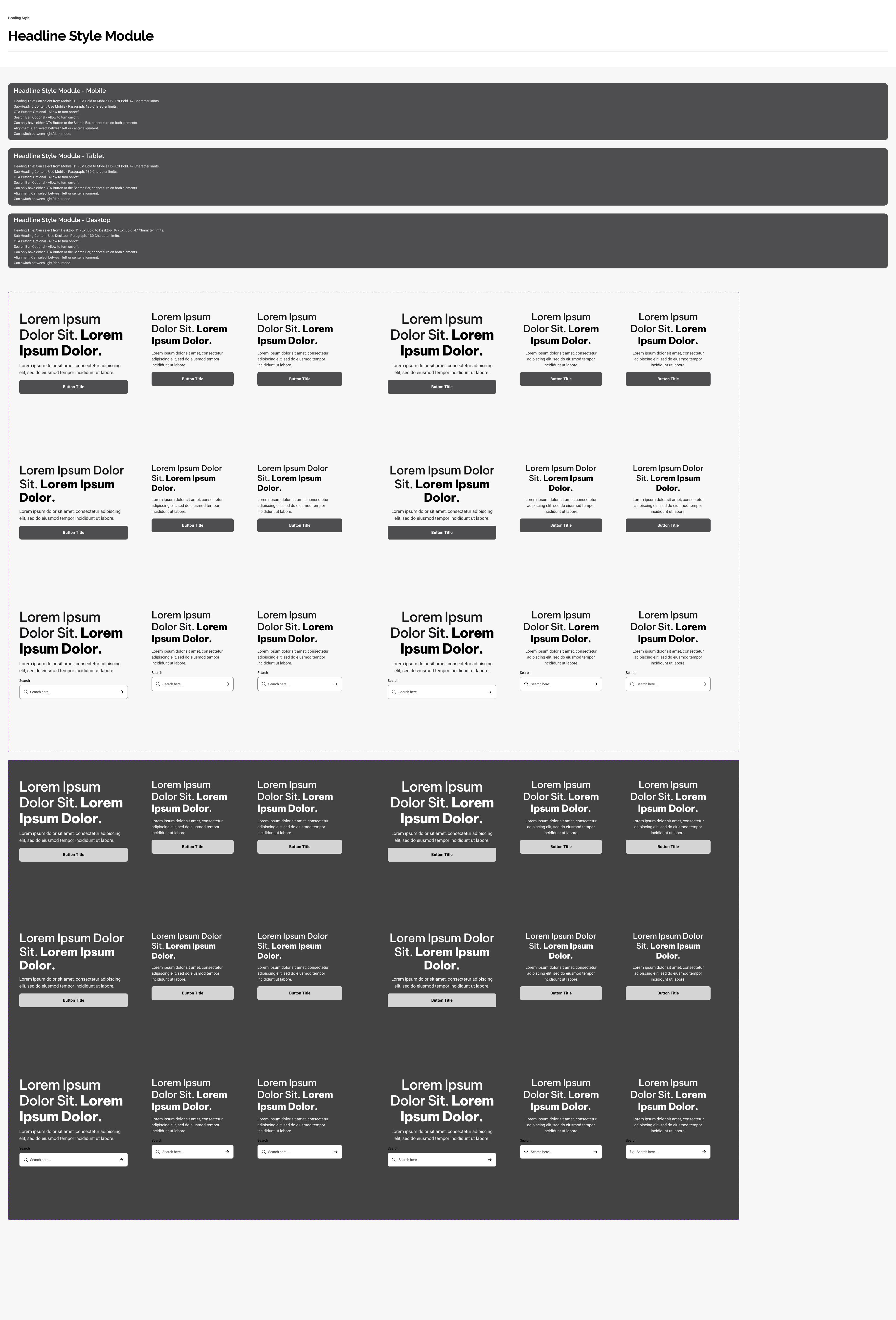
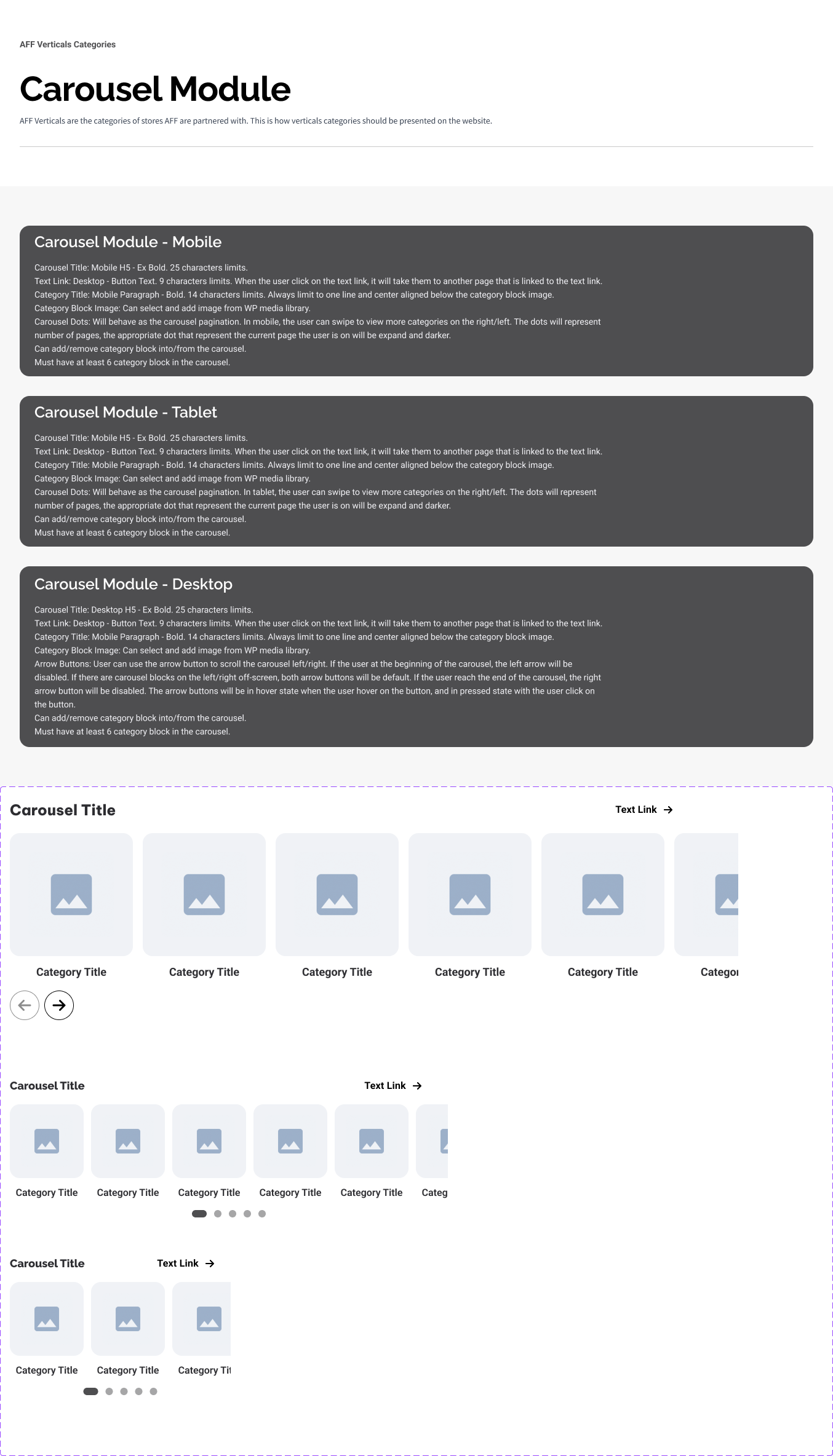
View All Current Modules
Review of Atlas Design System
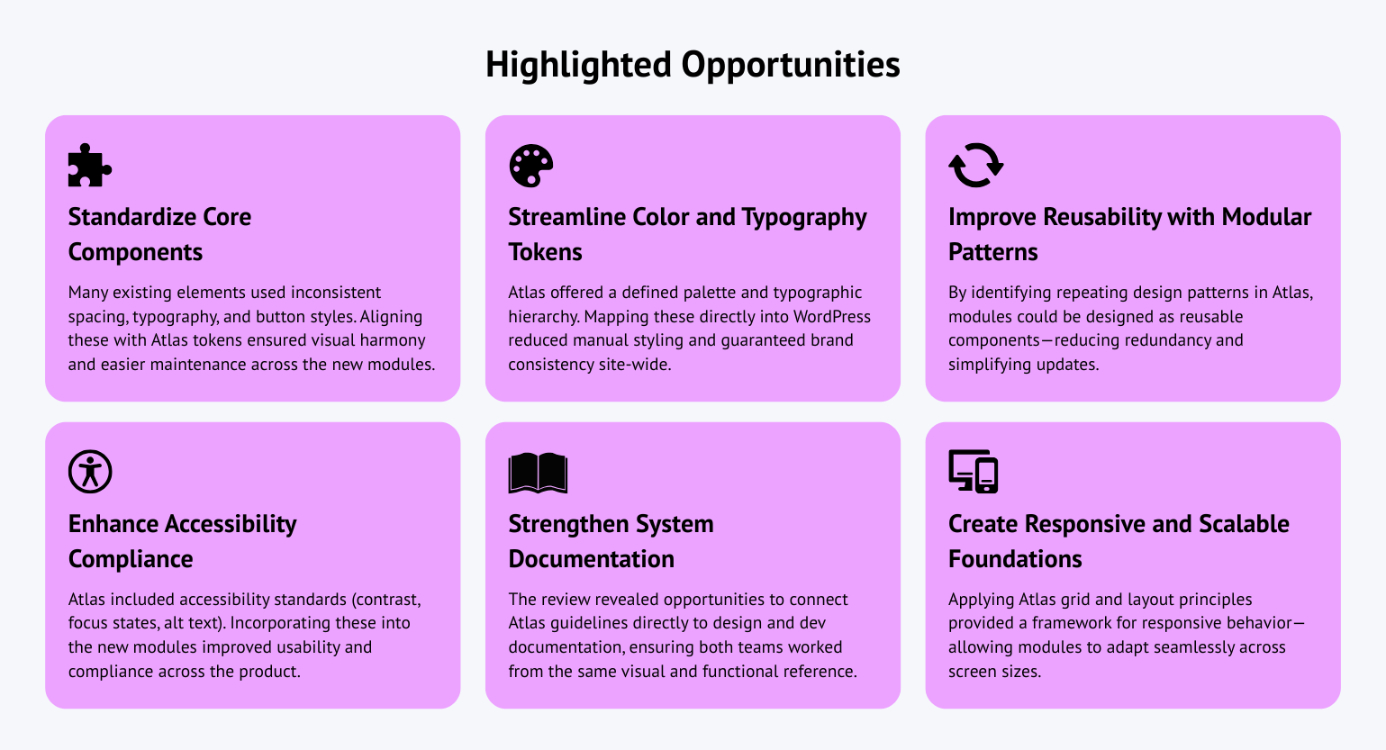
As part of the audit, I reviewed the Atlas design system to evaluate how its visual and structural principles could be integrated into the new website modules. This review highlighted opportunities to improve consistency, streamline component usage, and reduce redundancy across designs. By aligning WordPress modules with Atlas guideline such as standardized spacing, typography, and interaction patterns. I ensured that the new system not only reinforced the brand identity but also created a more cohesive and scalable design foundation.
View Atlas Design System
Audit of New Website Designs
I audited the new website designs to assess how well the proposed layouts and interactions could be built using the existing WordPress modules. This review revealed key constraints, many visual components and layout variations required flexibility the legacy modules couldn’t support. These insights defined where new modules were needed to bridge the gap between creative intent and technical feasibility.
View Full New Website Designs
Each audit provided a unique lens into how the rebrand could succeed or fail within the existing WordPress framework. The review of current modules revealed functional and structural rigidity, while the Atlas design system audit uncovered opportunities for alignment and standardization. Finally, the audit of the new website designs exposed gaps that the old modules couldn’t support. Together, these insights shaped the foundation for the design phase, guiding the creation of a flexible, scalable modular system that aligned with both brand and business goals.
Evolving Through Design
Building on the audit & research findings, I mapped old versus new requirements to identify where existing modules could evolve and where new ones were needed. I designed flexible, reusable modules that maintained visual consistency with the Atlas design system while improving usability and scalability. Throughout the process, I refined each module from low-fidelity wireframes to high-fidelity designs, ensuring every component aligned with brand standards and supported a more intuitive, adaptable user experience.
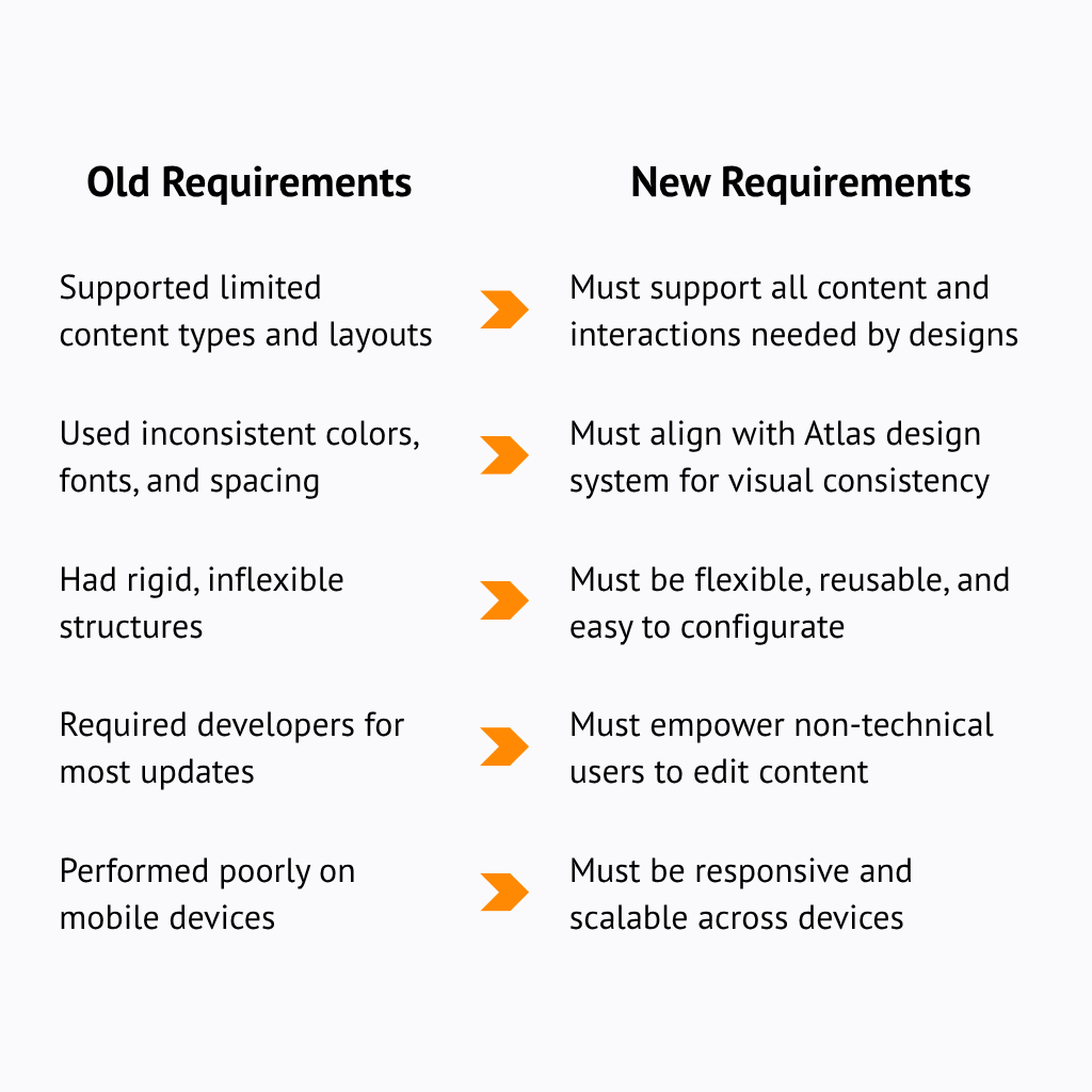
Mapping Old vs. New Requirements
I compared legacy modules with new design and Atlas design system to identify gaps, guiding which components to refine, rebuild, or create to lay the foundation for a flexible, scalable modular system.
Creating Flexible, Reusable Modules
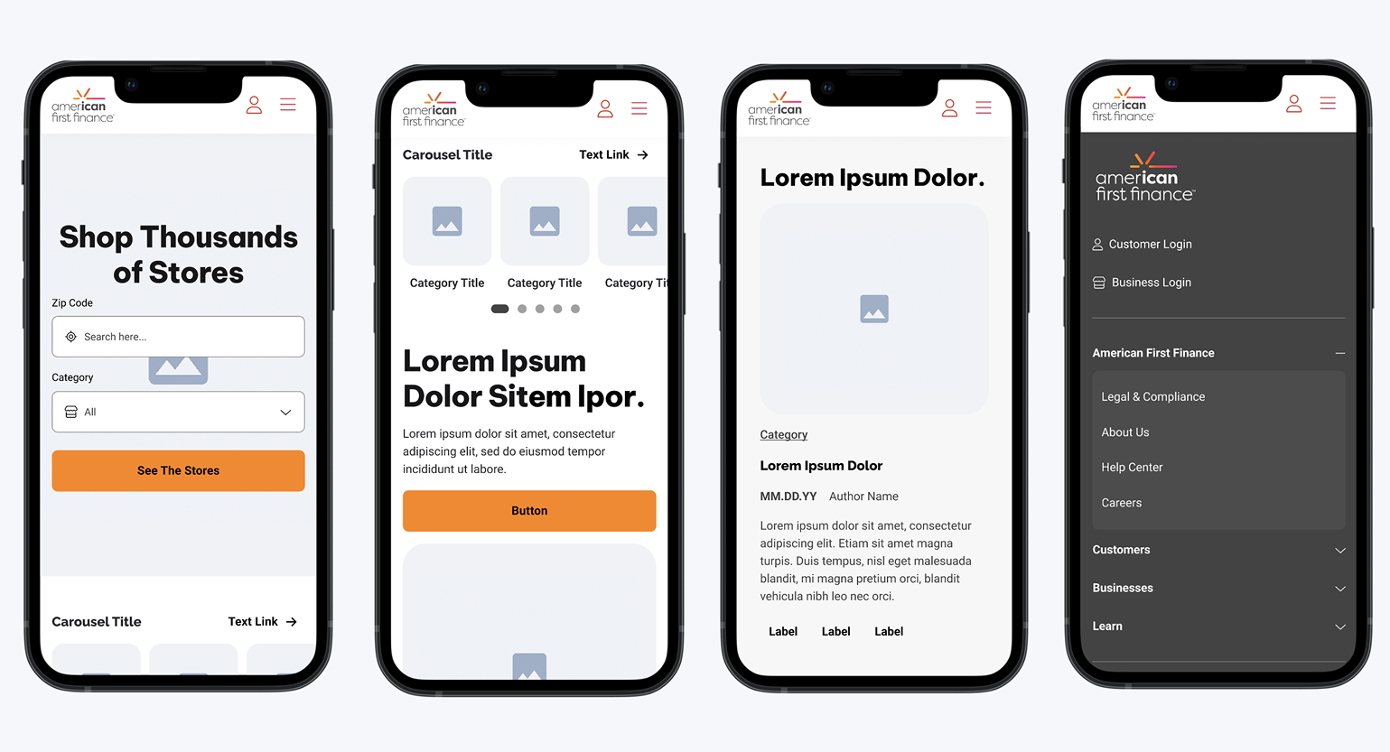
With a clear understanding of what needed to evolve, I designed a library of modular components that could adapt to multiple page types and content scenarios. Each module was built with flexibility in mind, allowing variations in layout, media, and copy without requiring developer changes. By documenting key use cases and design rules, I ensured every module could be easily combined, reused, and scaled, giving teams the freedom to build consistent, brand-aligned pages with minimal friction.
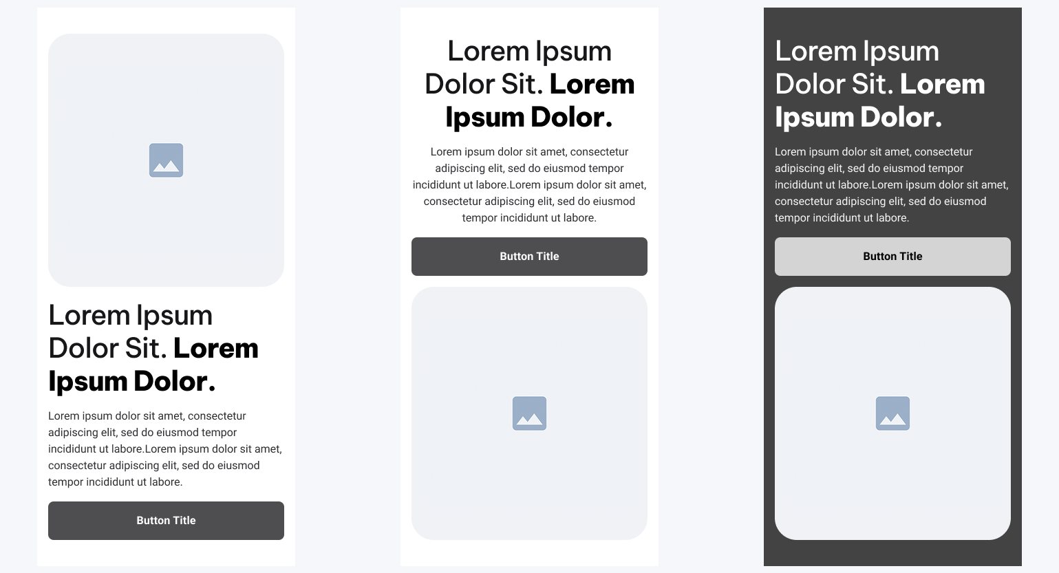
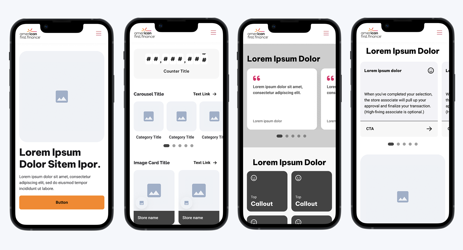
Hero Module Examples
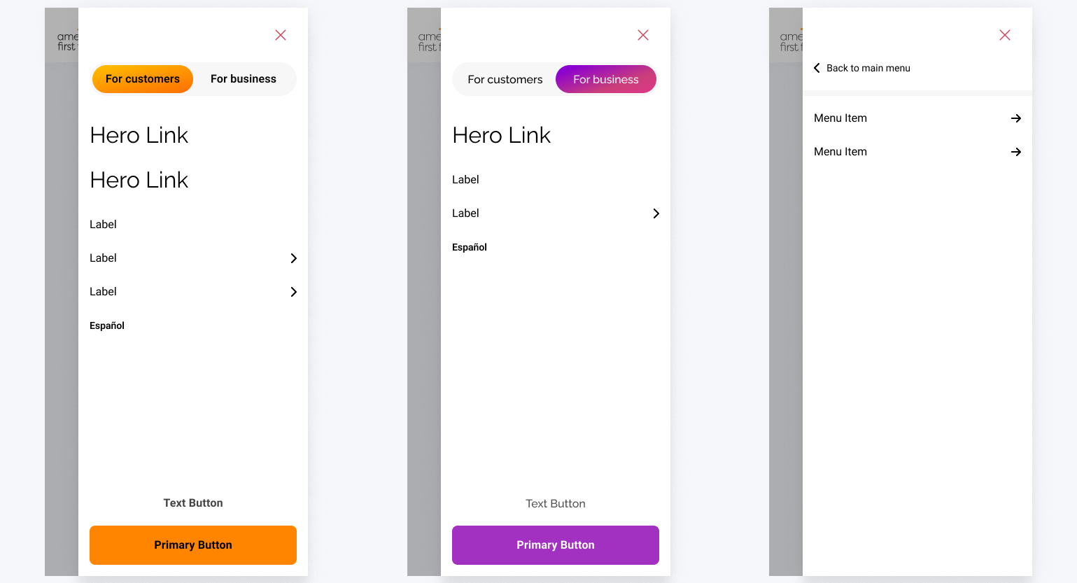
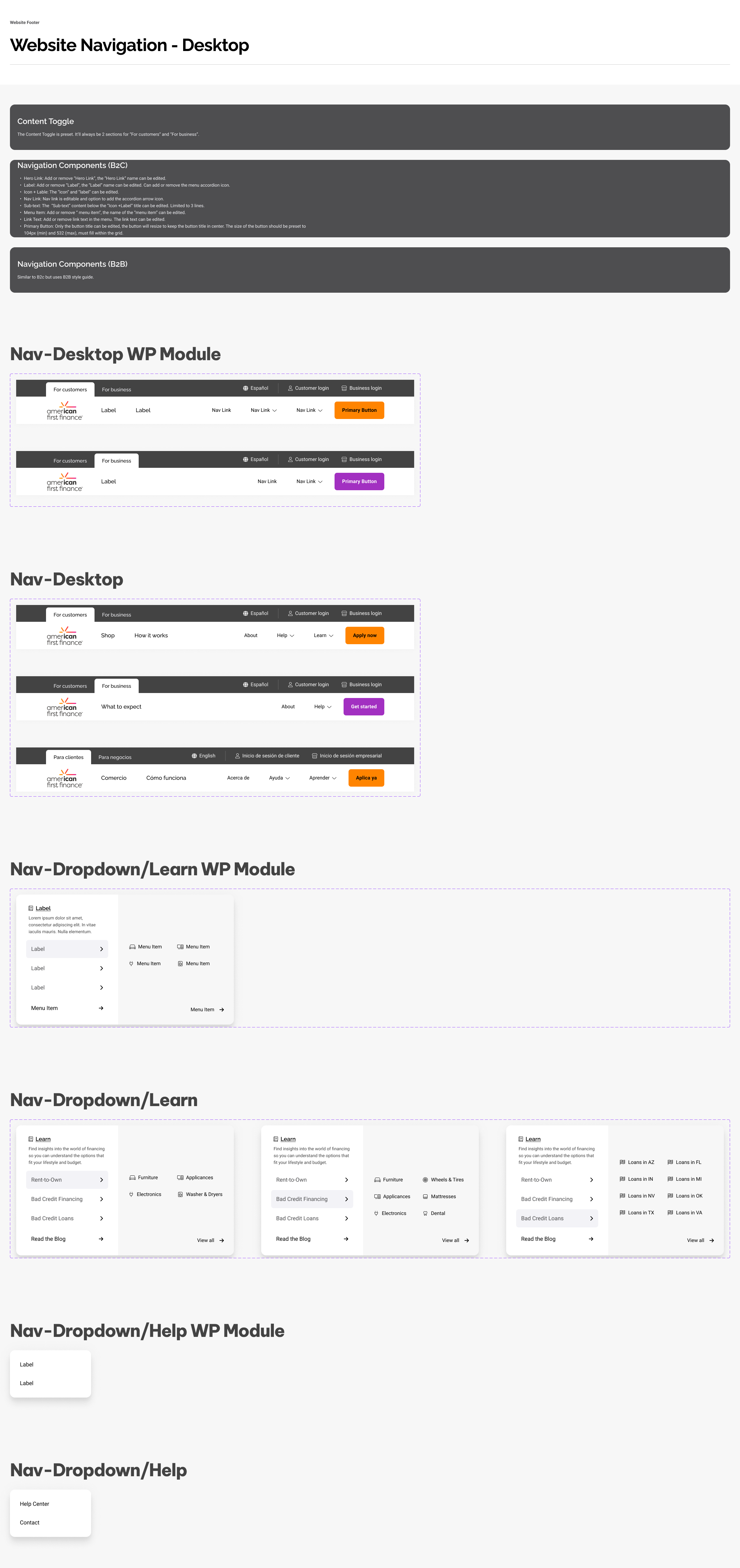
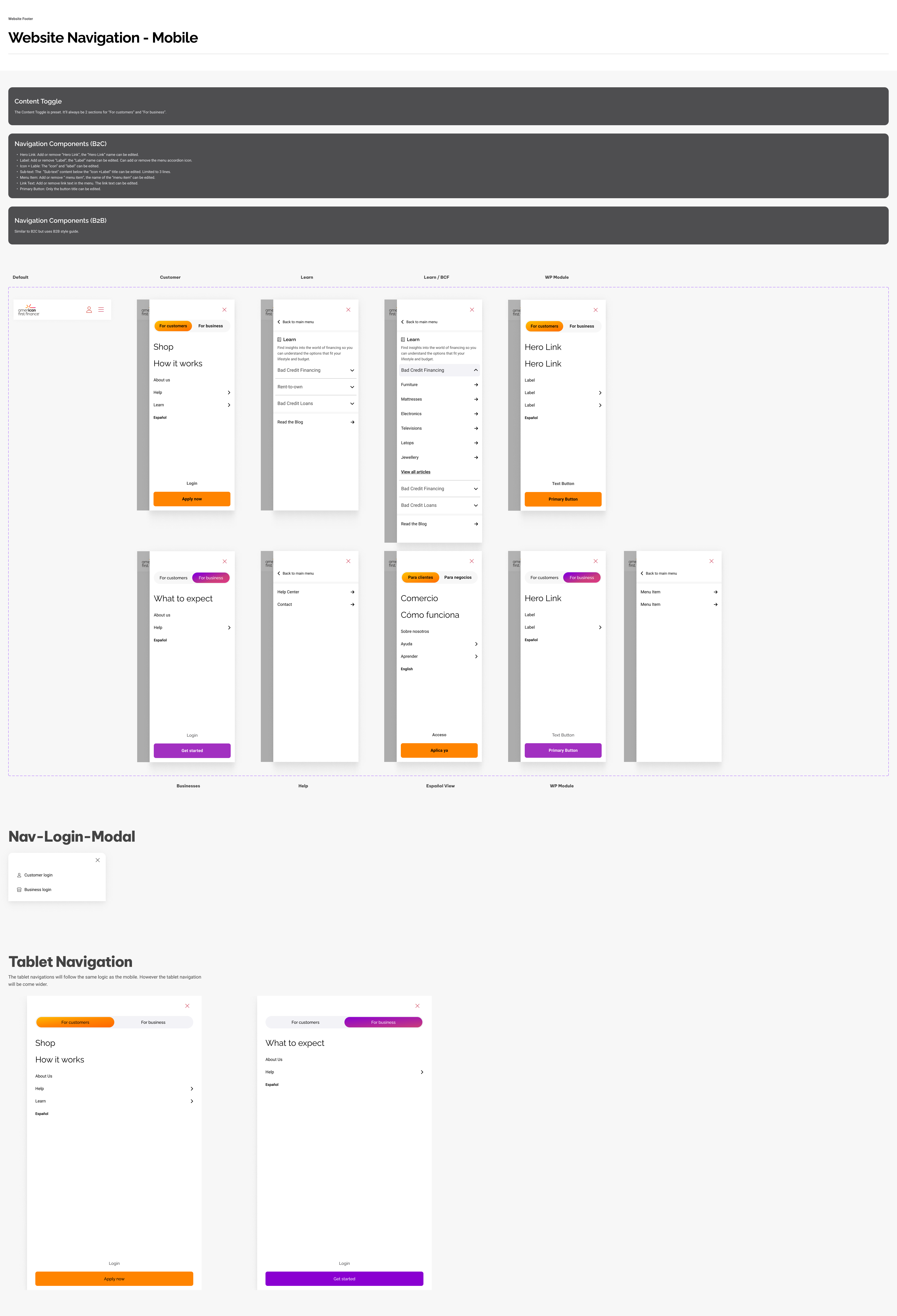
Navigation Module Examples
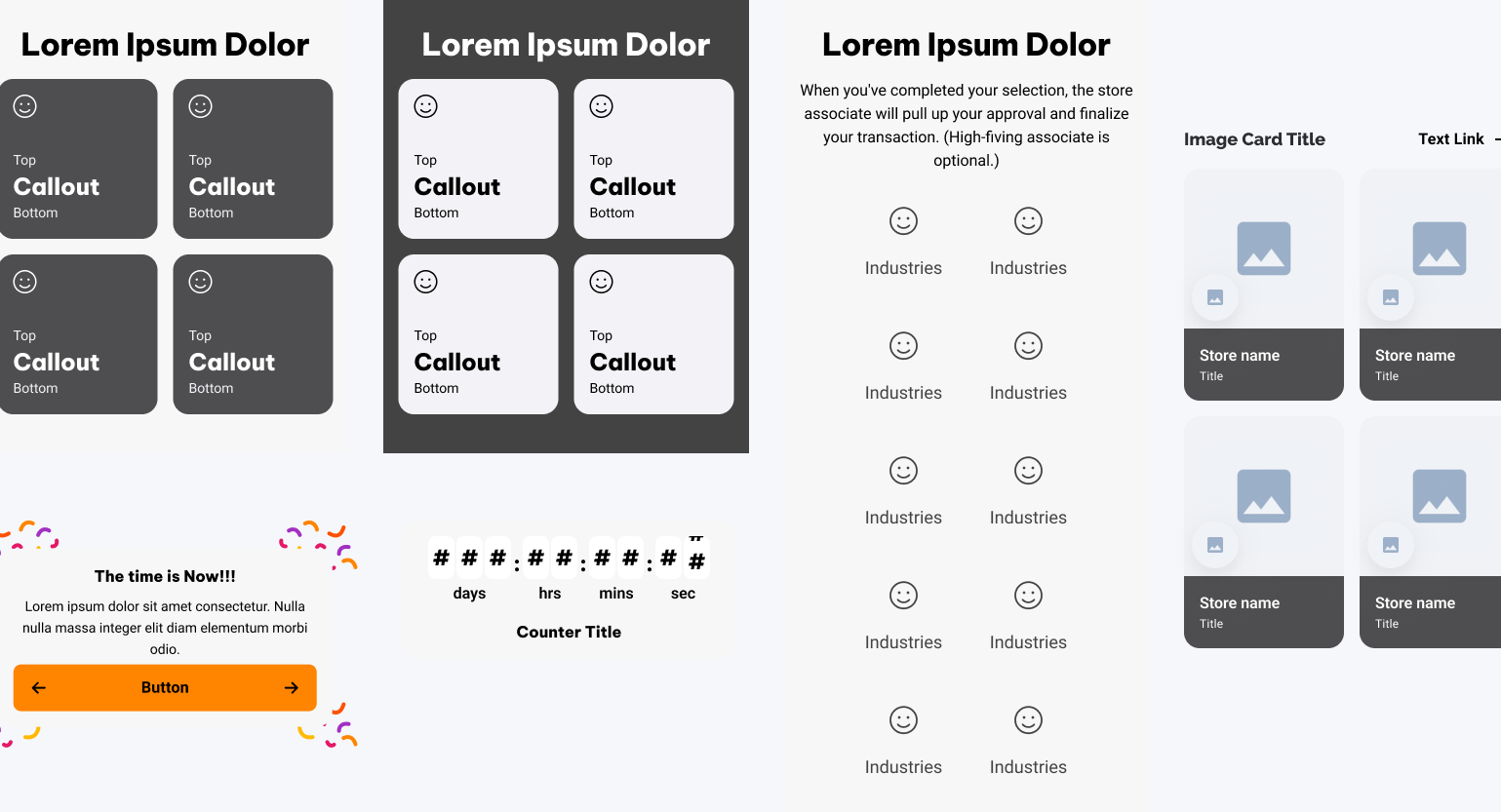
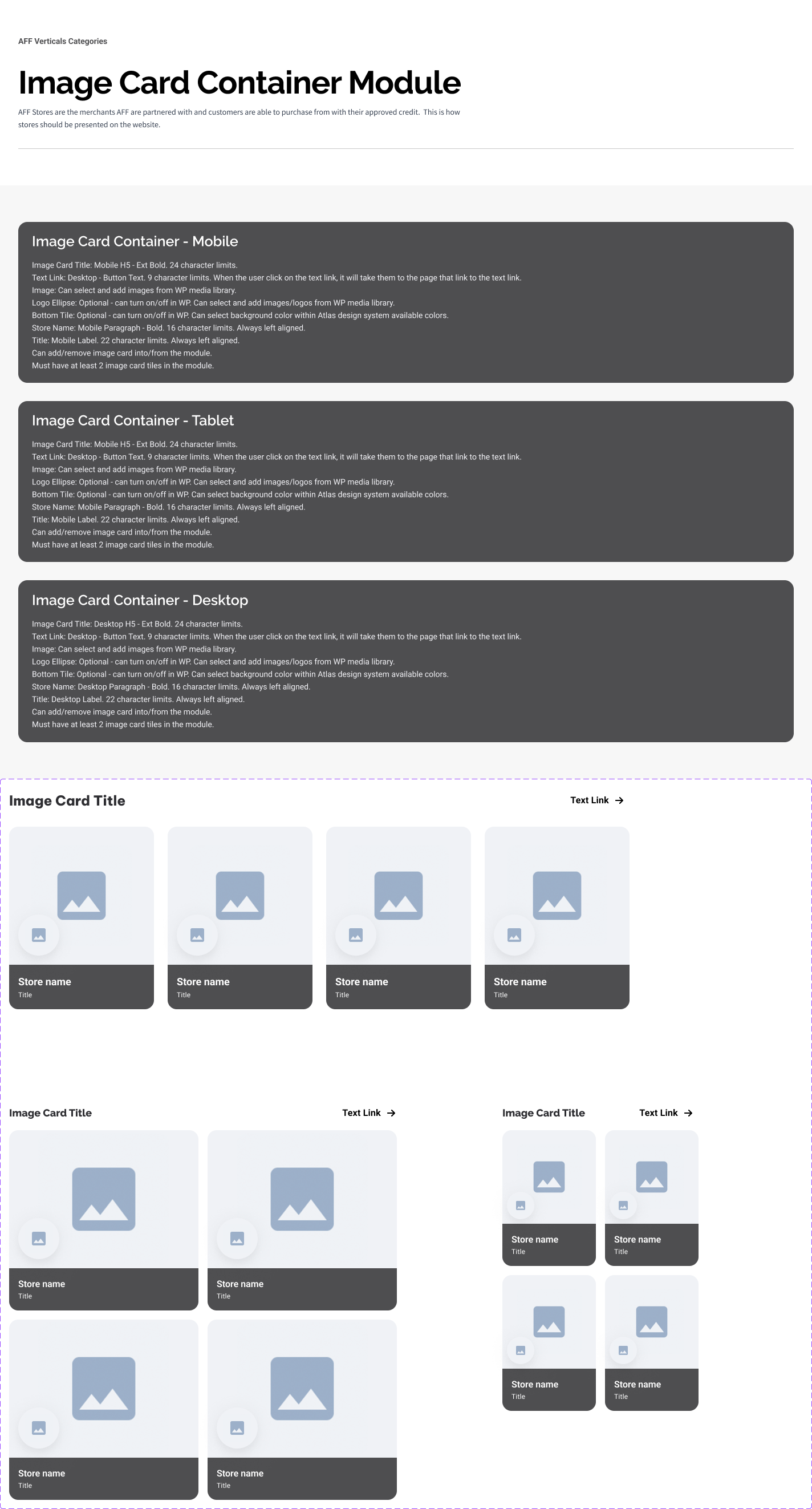
Other Module Examples
Aligning Visual Consistency with Atlas While Keeping UX Intuitive
To ensure every module reflected the rebrand, I aligned visual design decisions with the Atlas design system and integrating standardized color tokens, typography, and spacing rules. Each component was refined to maintain visual harmony while keeping interactions simple and user-friendly. This balance of system consistency and intuitive UX allowed the new website to feel cohesive across every page, without sacrificing usability or creative flexibility.
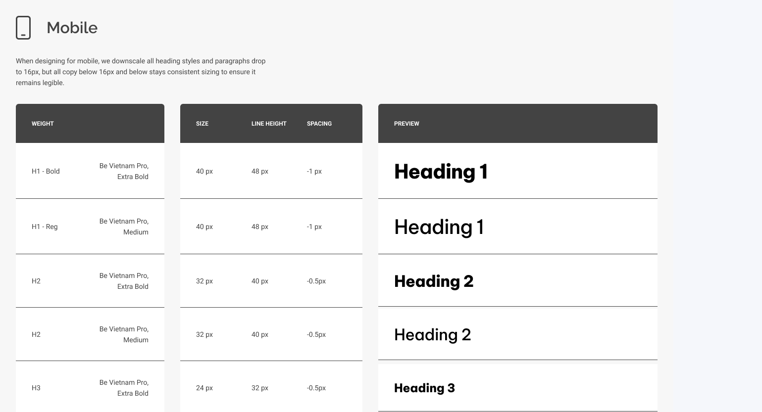
Typography
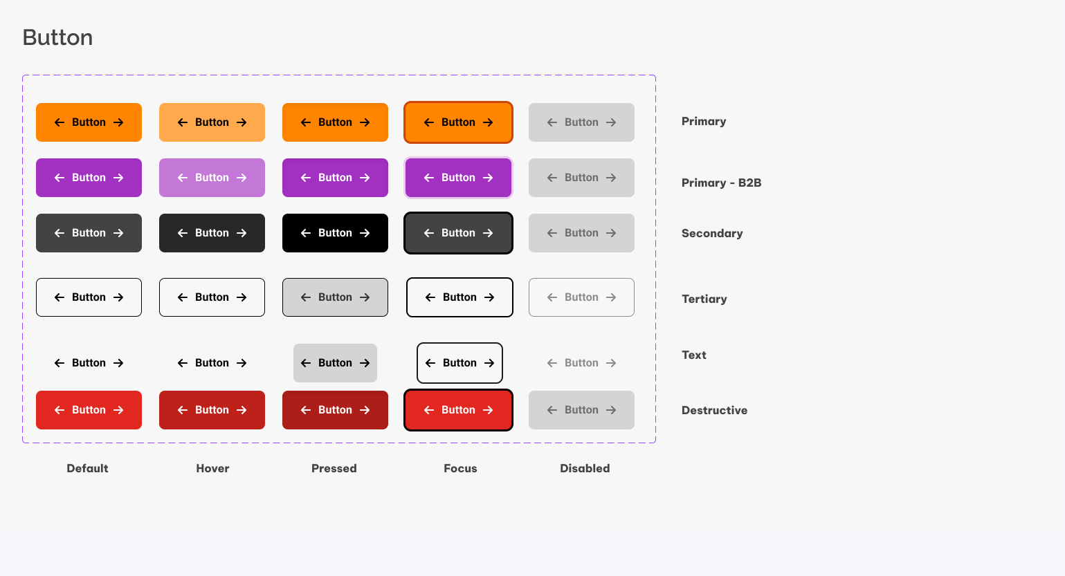
Button
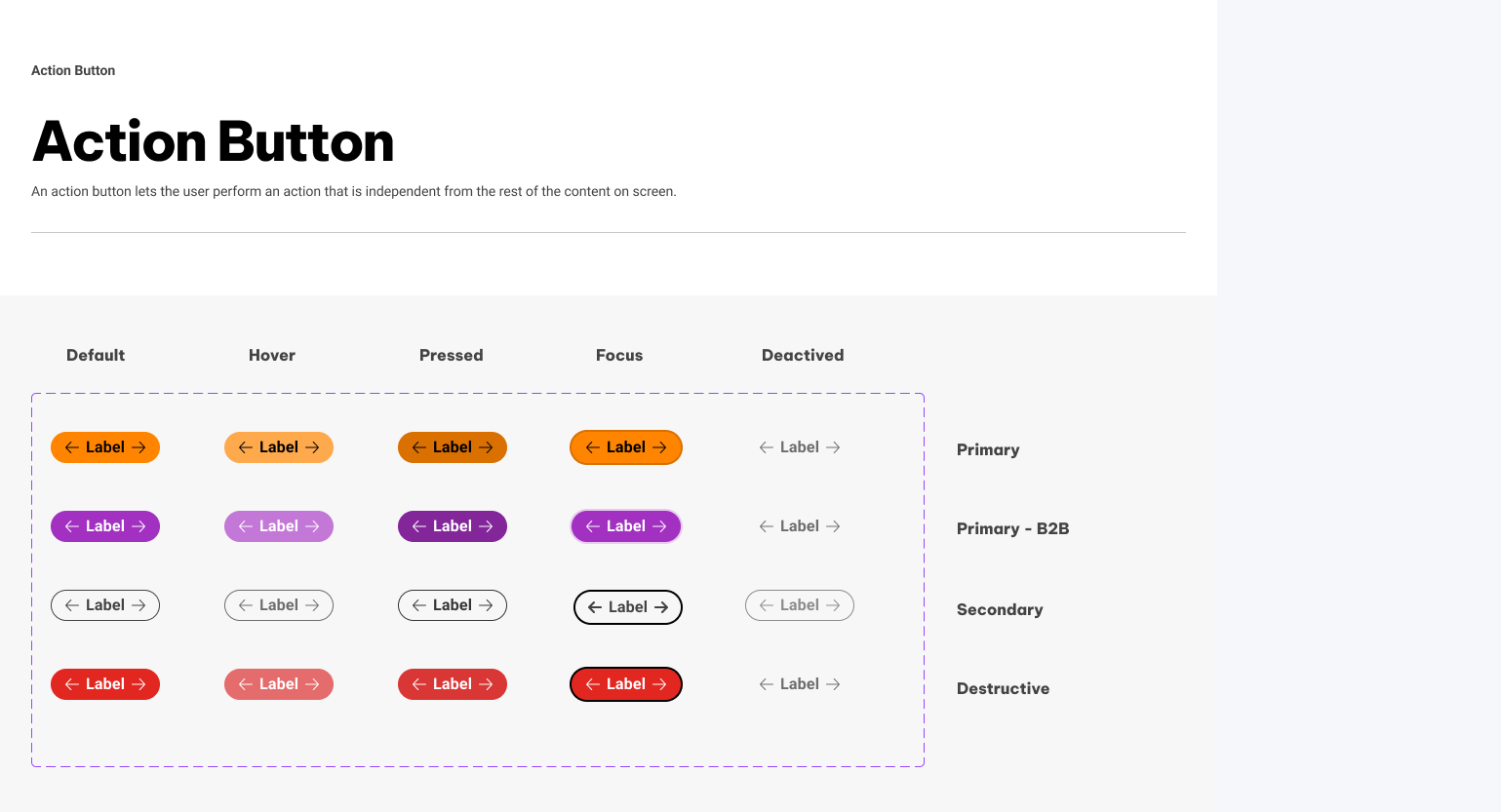
Action Button
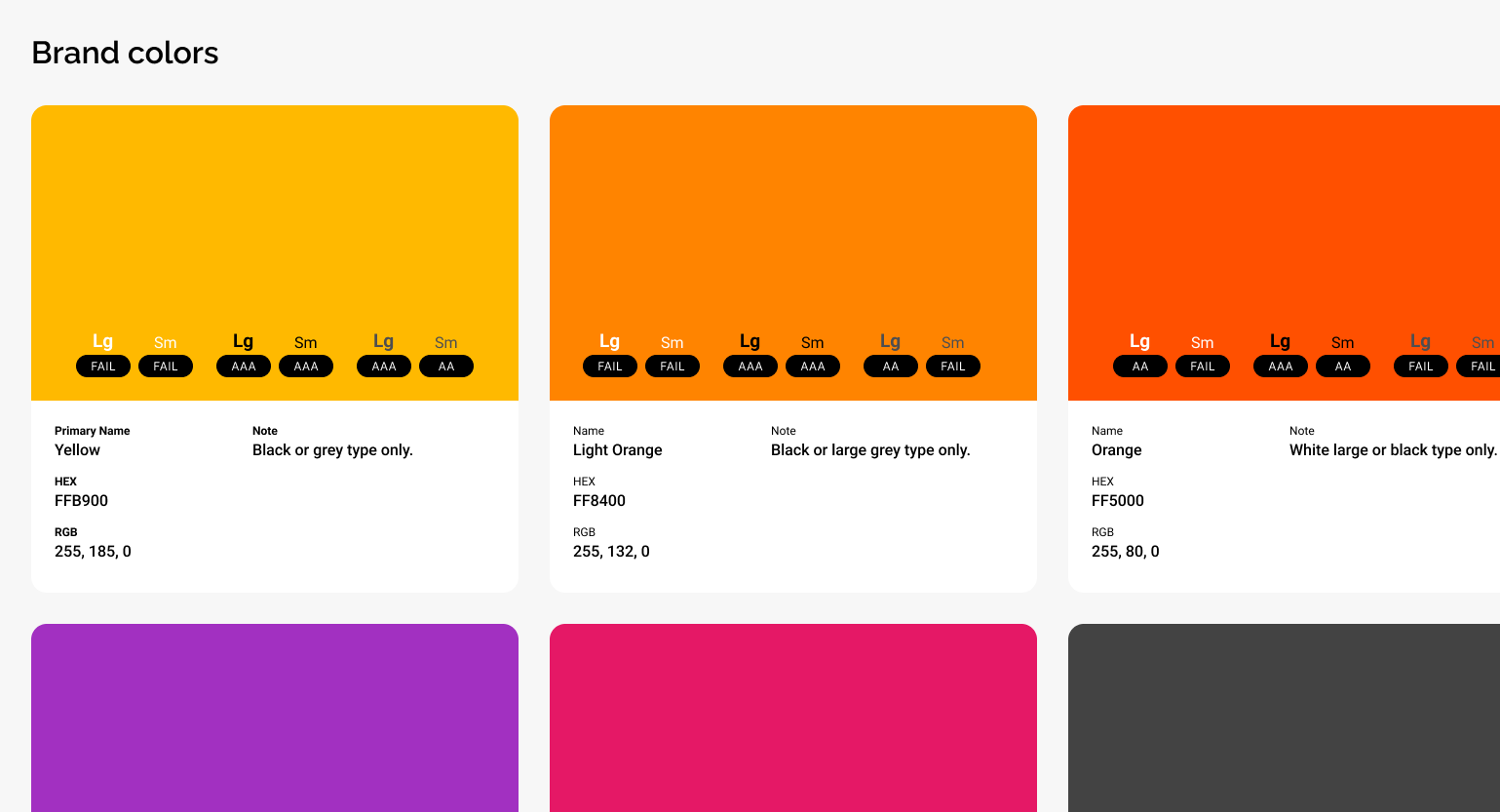
Colors
Iconography
Photography
Empowering Teams Independently
With each iteration refined and validated, the design process culminated in a fully realized modular system ready for implementation. The new components combined flexibility with consistency, translating Atlas principles into scalable WordPress modules that balanced creativity with technical efficiency. This foundation set the stage for the final solution: a system that empowered teams, simplified maintenance, and brought the rebranded website to life.
Final Set of New WordPress Modules
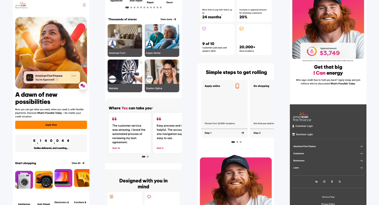
The end result was a complete library of modular, reusable WordPress components built to support the rebranded website. Each module was designed for flexibility, allowing content and layout variations without additional development work. This system streamlined updates and ensured every new page could maintain visual consistency while adapting to evolving business and design needs.
View All New Modules
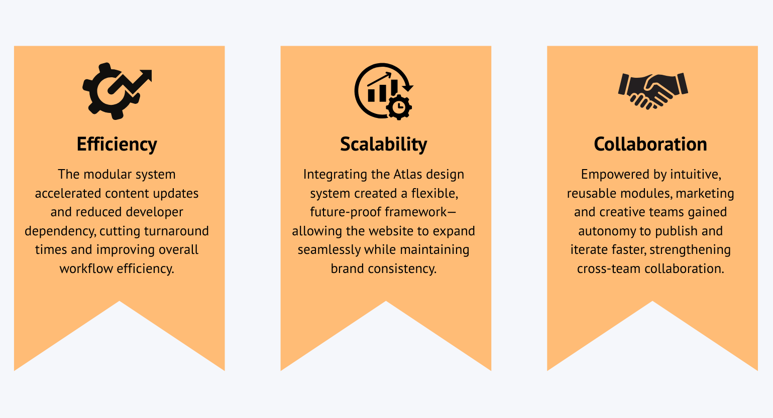
Empowering Teams to Update Independently
By shifting control from developers to content owners, the new modules enabled marketing and creative teams to make real-time updates directly within WordPress. Clear design guidelines and user-friendly configurations eliminated technical barriers, reducing turnaround time and empowering teams to publish confidently and autonomously.
Alignment with Rebranded Identity and Scalability
Every module was aligned with the Atlas design system, translating the brand’s updated visual language into a scalable, consistent framework. This alignment ensured the website could expand seamlessly as new features, pages, and campaigns were introduced, keeping the experience cohesive and future-ready.
View All Webpages Built Using New WP Modules
Collaboration Fuels Progress
The implementation of the new modular system marked a turning point for American First Finance’s digital presence. What began as a technical overhaul evolved into a scalable, collaborative framework that redefined how teams worked. With development bottlenecks removed and design consistency fully integrated, the impact extended beyond aesthetics, which transforming workflows, accelerating updates, and setting a new standard for efficiency across the organization.
Reflection Drives Growth
As the new system delivered measurable results, it also revealed valuable lessons highlighting what worked, where challenges emerged, and how the process could evolve to drive even greater impact in future projects.
Winning Moments
Early Audit Insights
Conducting thorough audits at the start of the project revealed key design and technical gaps early on. This clarity helped the team align priorities and make informed decisions that guided every phase of the rebrand.
Cross-Team Collaboration
Close collaboration across design, development, and marketing kept momentum strong. Frequent feedback loops created alignment between creative goals and technical feasibility, ensuring progress stayed smooth and purposeful.
Modular Framework Success
The new WordPress modules transformed how content was created and managed. By enabling flexibility and reusability, the system streamlined updates, reduced developer dependency, and empowered teams to move faster.
Atlas Integration Alignment
Embedding Atlas design system standards within each module ensured brand consistency and scalability. This alignment brought a cohesive, modern visual identity to every part of the website experience.
Lessons Learned
Balancing Design and Feasibility
Translating creative ambition into a technical framework required constant negotiation. Striking the right balance between design innovation and system constraints was a challenge that ultimately drove smarter solutions.
Testing Earlier, Learning Faster
Earlier usability testing could have identified friction points in how internal teams interacted with modules. Incorporating feedback sooner would have improved adoption and fine-tuned the authoring experience.
Designing for the Team
This project reinforced the value of designing not just for end-users, but also for the people behind the product. Empowering teams with well-designed tools proved just as impactful as improving the customer experience itself.