
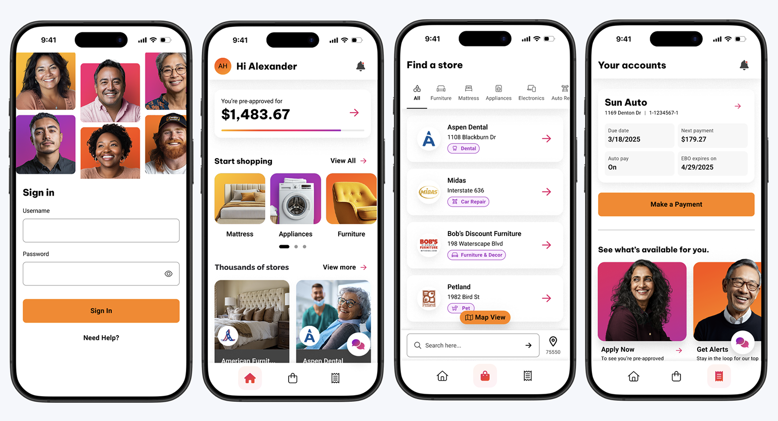
AFF Mobile App Login Flow - Designing Trust at First Tap
When American First Finance (AFF) decided to launch its first-ever mobile app, the login experience became the cornerstone of the product. This wasn’t just a matter of screens and credentials, it was about trust. For a company whose customers depend on financing services and timely payments, every tap carries emotional weight. As the Product Designer on the project, I set out to design an authentication experience that made users feel confident, safe, and understood. The challenge was to translate a legacy, web-based login process into a mobile experience that was not only functional but emotionally reassuring, one that could stand beside leaders like Affirm and Klarna while staying true to AFF’s values.
Designing Secure, Seamless Access
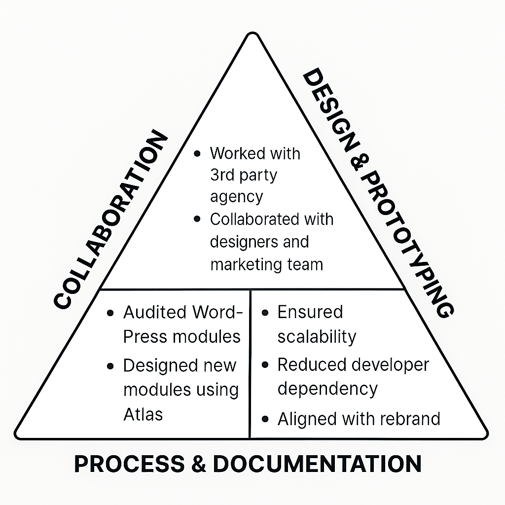
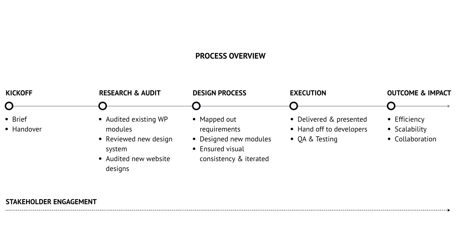
I led the design for the mobile app’s login and authentication flow, working closely with project managers, developers, the compliance team, and marketing team. My goal was to merge compliance-driven complexity with intuitive usability, ensuring every interaction was effortless, secure, and visually cohesive with AFF’s evolving brand.
Throughout the process, I wore multiple hats: researcher, flow architect, prototyping, and usability testing. I facilitated alignment between technical and creative teams, documented design decisions, and validated concepts through iterative prototyping. The result was not just a functional login experience, but a foundation for how AFF would build trust on mobile moving forward.
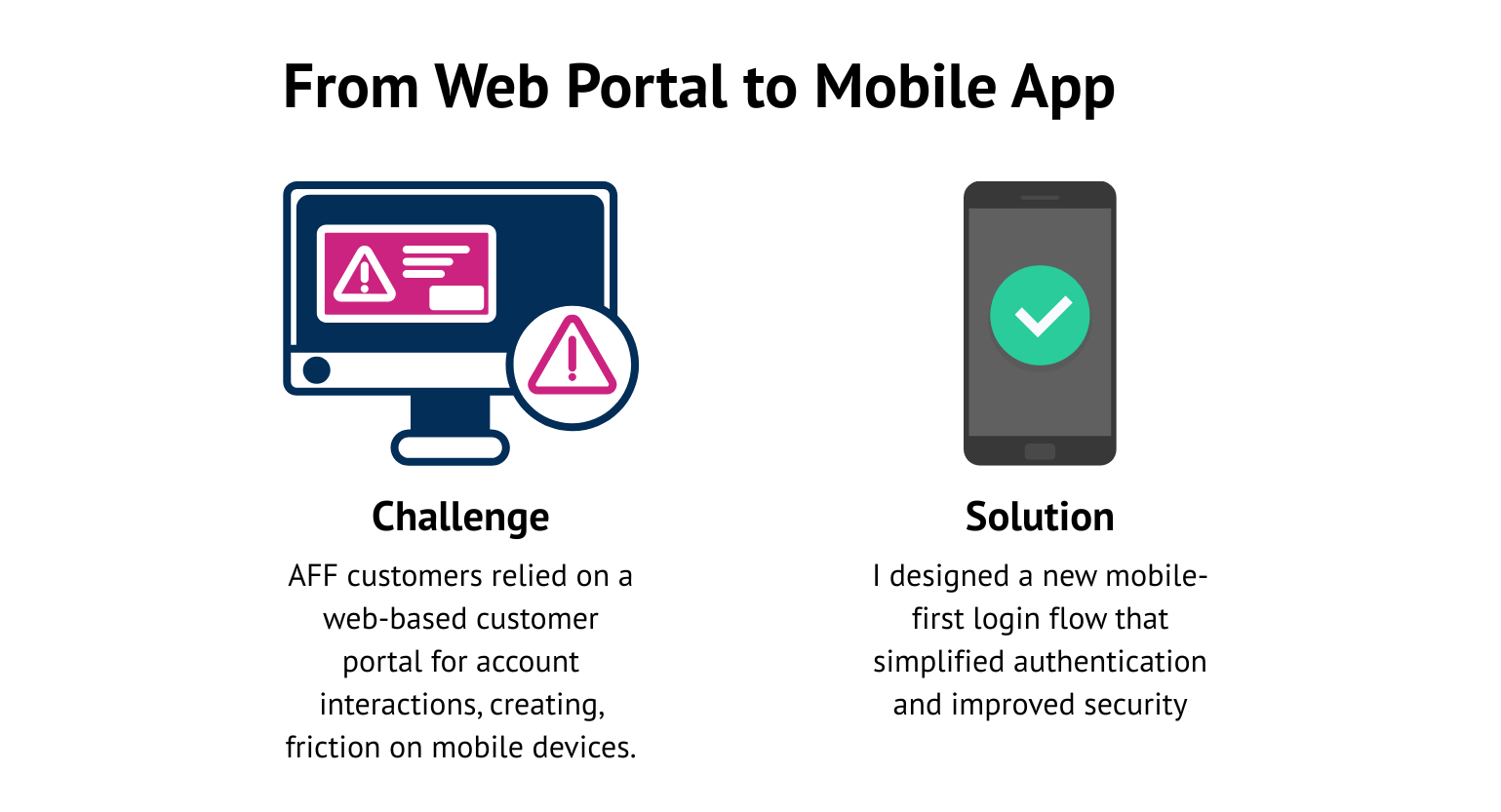
From Web Portal to Mobile App
Challenge
For years, AFF customers had accessed their accounts exclusively through a desktop-oriented customer portal. It worked, but it wasn’t built for the way people live now. The flow involved multiple redirects, limited mobile optimization, and error handling that left users uncertain about what went wrong. The challenge wasn’t simply to rebuild this experience for mobile; it was to reimagine it. I needed to create a login flow that:
1. Felt fast and intuitive on any device
2. Communicated security without overwhelming users
3. Reflected AFF’s rebrand and new Atlas design system
Solution
I designed a new mobile-first login flow that simplified authentication, introduced modern security standards (biometric login, password-less options), and maintained brand consistency with the upcoming rebrand. The goal was to create an experience that felt fast, secure, and human-centered, which matching the standards set by competitors like Affirm and Klarna.
Every Screen Shapes Trust
From the beginning, I treated the login experience as more than an entry point, it was the first conversation between the app and its users. Every message, color, and delay had to convey trustworthiness.Through research, flow mapping, wireframing, prototyping, usability testing and close collaboration with engineering and compliance teams, I refined each step of the authentication journey. Each screen was simplified, every action validated, and every moment designed to assure users that they were in the right place, and in control.
Understanding the Users and Landscape
Competitive Research
I began by analyzing leading fintech apps login flow like Affirm, Klarna, Snap, and Progressive, to understand how they made login feel effortless. Their strength wasn’t just in speed; it was in emotional design, which using simple copy, familiar icons, and subtle transitions to make security feel human.
View Full Competitors Login Flow
User Journey Audit
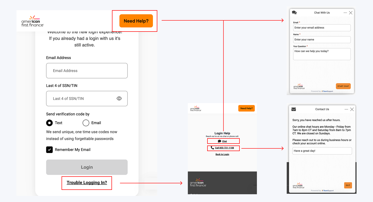
Next, I audited AFF’s existing customer portal, mapping its login path and identifying critical friction points: multiple redirects, inconsistent states, and inaccessible error handling.
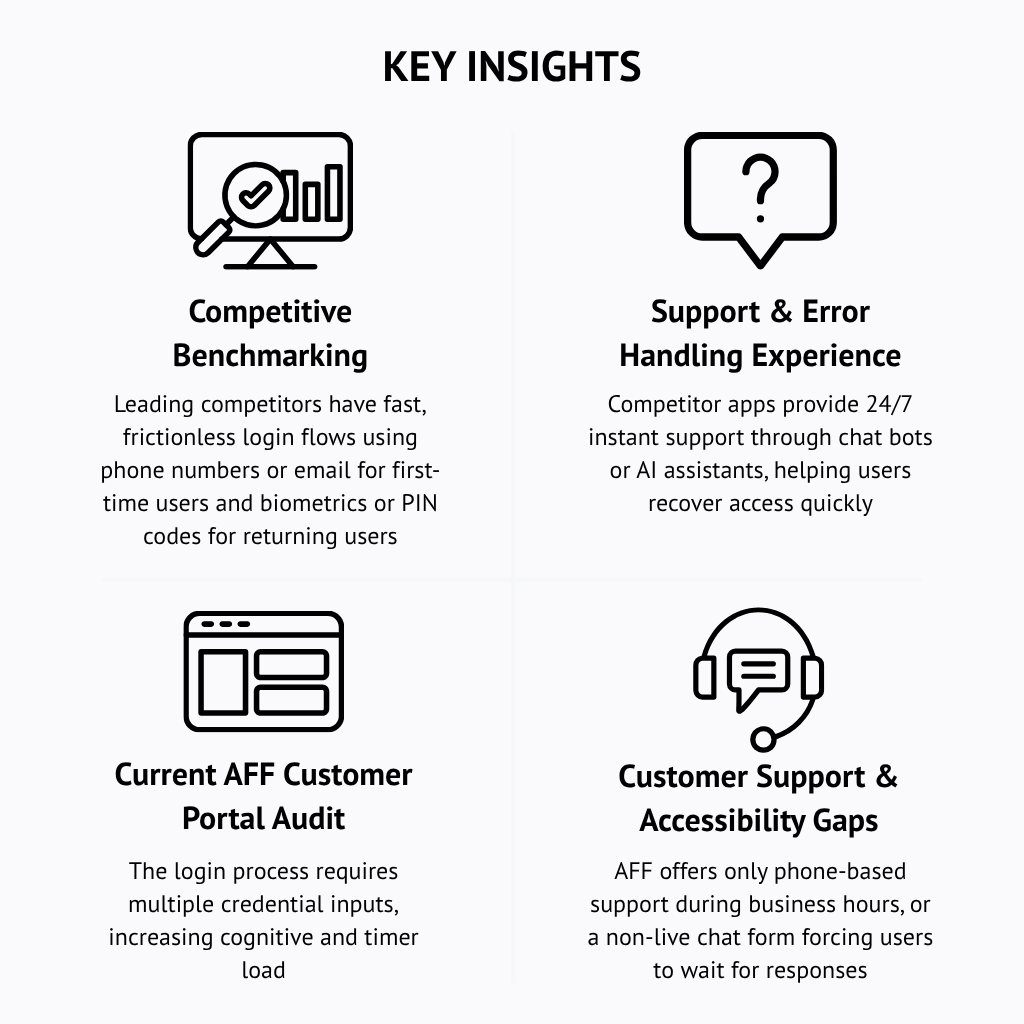
Current AFF's Customer Portal Review Insights:
- AFF’s current system lacks real-time guidance or self-help options during login failures, creating user frustration.
- The login process requires multiple credential inputs, increasing cognitive and time load.
- Verification code delivery issues frequently prevent users from logging in.
- This technical bottleneck contributes to higher abandonment and support requests.
- AFF offers only phone-based support during business hours and a non-live chat form, forcing users to wait for responses.
- The lack of in-app troubleshooting options breaks continuity and trust during critical moments of access.
- Opportunity: implement instant in-flow assistance, such as self-help options for password reset or a chatbot integrated within the login experience.
✅ Key Takeaway: Competitors use clarity, instant support, and lightweight authentication to earn trust. AFF’s opportunity lies in reducing friction and embedding help within the login flow itself, turning frustration into reassurance. Customers valued convenience and trust equally. A login that felt “safe but slow” was just as frustrating as one that felt “fast but uncertain.” This insight guided every design decision that followed.
Evolving Through Constraints
The research phase made one thing clear: every barrier in AFF’s login flow was really a barrier to trust. Users weren’t just asking for access, they were asking for reassurance, speed, and support when things went wrong. With these insights in hand, the design process shifted focus from complexity to clarity , and turning each finding into a practical, human-centered solution that simplified authentication while reinforcing confidence at every step.
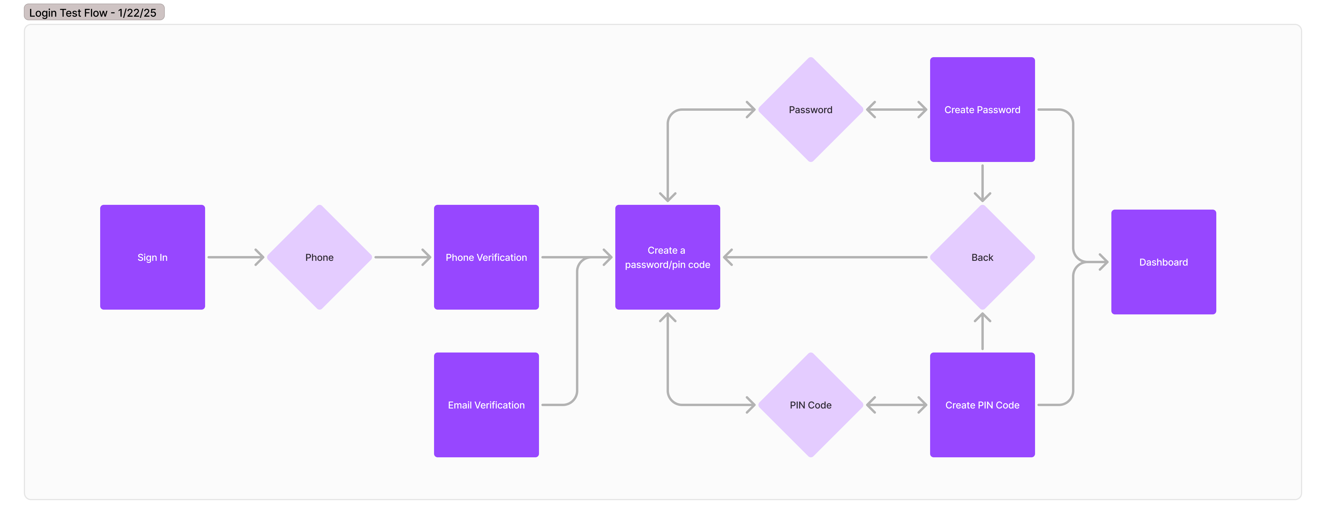
Mapping the Flow
Before finalizing the authentication flow, one of the earliest decisions we faced was whether customers should log in using their phone number or email address. Both options offered benefits: phone numbers felt more convenient for first-time users, while emails aligned better with existing customer records and security verification systems.
Low-Fidelity Wireframes
 View Full Lo-Fi Login Flow
Usability Testing
To make an informed choice, I designed two quick login flow prototypes and conducted informal usability tests with co-workers from different departments, simulating real-world diversity in user preferences and technical familiarity. The results revealed a strong preference for phone number login due to speed, familiarity, and lower friction on mobile devices.
These early findings not only shaped the foundation of the final flow but also demonstrated the value of testing small decisions early, which helps saving time downstream and ensuring the experience felt intuitive from the very first tap.
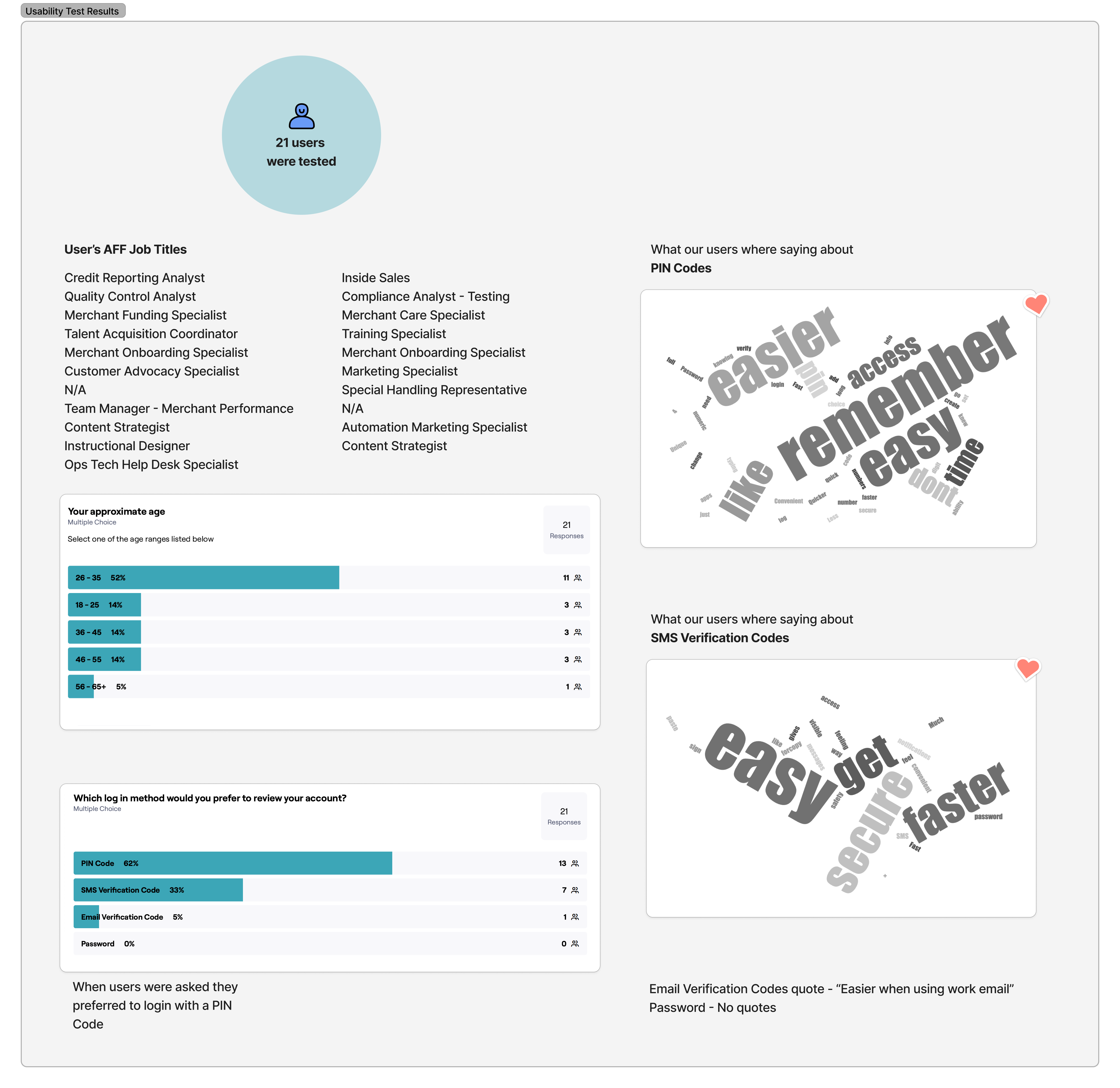
Usability Test – Key Insights: Phone vs. Email Login
1. User Preference:
• 81% of participants preferred using their phone number to log in rather than email.
• Participants described the phone-based login as “faster,” “easier to remember,” and “more natural on mobile.”
2. Perceived Convenience:
• Most users found entering their phone number quicker and more intuitive than typing a full email address on mobile keyboards.
• Phone login was perceived as less error-prone due to shorter input and automatic formatting cues.
3. Verification Process Feedback:
• Users appreciated the simplicity of receiving and entering SMS verification codes, describing the process as “easy,” “secure,” and “instant.”
• However, some expressed concerns about delays in receiving verification codes, aligning with known backend issues flagged by developers.
4. Email Login Observations:
• Email-based login felt slower and more cumbersome, especially for users managing multiple accounts.
• Participants associated email login with desktop behavior, not quick mobile access.
5. Key Takeaway:
• Phone number login created less friction and higher trust for mobile-first experiences.
• It established the foundation for a faster, more intuitive authentication flow while aligning with user expectations shaped by modern fintech apps.
From Insights to Iteration
After testing the initial login flows, the results clearly favored phone number + PIN authentication. However, presenting these findings to stakeholders revealed broader system and security considerations. The design process evolved from here, balancing what users found intuitive with what the business could securely support.
Security Constraints
During stakeholder review, the engineering teams raised concerns about:
• Multiple phone numbers and emails tied to single customer accounts.
• Ongoing issues with verification code delivery failures.
• PIN codes being considered less secure than traditional passwords.
To ensure long-term scalability and compliance, leadership decided to move toward a username and password system, supplemented by biometric login for returning users.
Redefining the Login Flow
With the new direction established, I redesigned the flow to incorporate username + password login while keeping the experience simple and approachable. The focus shifted from “speed at all costs” to “clarity and confidence.” I introduced clearer affordances for password entry, streamlined error states, and planned for future biometric integration once the MVP proved stable.
Mapping New Authentication Paths
To support this new approach, I remapped all authentication scenarios, including first-time login, returning users, password recovery, and biometric setup. This ensured technical feasibility while maintaining consistent UX patterns across all states. Each path was documented and validated with engineering and QA for seamless implementation.
.png)
High-Fidelity Design & Atlas Integration
Building upon the Atlas Design System, I created high-fidelity prototypes that maintained brand consistency while improving usability. The new design emphasized accessibility, larger input areas, and error clarity. Even with added security steps, the flow remained visually calm and human-centered, and reducing anxiety during login.

Building the Foundation for Trust
Once the new login flow was finalized, the results spoke for themselves. What started as a debate between usability and security evolved into a balanced experience that met both user and business goals. The redesigned flow simplified authentication, reduced friction, and instilled confidence, leading to faster logins, fewer drop-offs, and a noticeable boost in user trust. Beyond usability, it set the foundation for future features like biometric authentication, proving that thoughtful design can scale both security and empathy in equal measure.
Evolving with Every Login
While the measurable outcomes showed clear progress, the true impact of this project went beyond the interface. Designing AFF’s first mobile login flow became a lesson in adaptability, navigating between user needs, security standards, and business realities. Each challenge helped me grow not just as a designer, but as a collaborator and problem-solver.
Winning Moments
Early Validation Through Testing
Conducting quick internal usability tests before committing to a full flow helped uncover preferences and usability patterns early. This agile validation built team confidence and shaped more informed design decisions.
Cross-Functional Collaboration
Working closely with the security, development, and product teams made it possible to balance user experience with technical and compliance realities. These partnerships ensured that every solution was both human-centered and feasible.
Designing for Trust, Not Just Access
The project reinforced that login experiences are emotional touchpoints, not just functional gateways. By focusing on clarity and reassurance, I learned how visual and verbal tone can communicate safety as effectively as security systems do.
Lessons Learned
Balancing Ideal UX with Real-World Constraints
While users preferred simpler login methods, system limitations and compliance needs required compromise. This experience deepened my understanding of how to design within complex business and technical boundaries.
The Importance of Scalable Thinking
Designing with flexibility in mind, even when limited to MVP scope, and ensured the experience could evolve. Planning for biometrics and multi-factor authentication early prevented future redesigns.
Continuous Alignment Matters
I learned that alignment doesn’t happen once; it’s maintained through constant communication. Early collaboration with stakeholders was key to transforming pushback into productive direction.
Closing Reflection
This project reminded me that trust in fintech design isn’t just secured through encryption, it’s earned through every interaction. Each iteration taught me how to advocate for users while collaborating across constraints, turning complexity into clarity one login at a time.